Showing posts with label Digital Painting. Show all posts

Thursday, 23 September 2010

Backyard


There were some great, low-hanging clouds in the sky this afternoon.

This epic cloud in our backyard made me stop dead in my tracks. The massive formation towered above our house like a mountain, the scale reinforced by the bush in the foreground. I tried to remember as much as I could about the colours and values, before doing this quick memory painting. The subtle warmth in the clouds from the afternoon sun is often lost in a photograph. 

Thursday, 25 March 2010

Pirates colour studies

These are a bunch of 15 minute colour studies from one of the Pirates of the Caribbean movies.
Movie shots are carefully framed and colour designed for story-telling and mood so it's a great study resource for all the beautiful images you might want.


It's funny how the more you learn about something the more you realise how little you know. Back in the days when I started colouring digitally I knew very little about colour theory, or light for that matter, but I knew what I liked so that made me confident in my colour usage. Since then I've gradually caught on to the complexity of the world of colours and light, which all of a sudden made it into something rather difficult.

Colour is one of those shifty topics where rules are rarely general and things are judged on a case-to-case basis. There's a lot that could be said about it, but the piece of advice that I keep stumbling across is "When all else fails, go by what looks right". 

There's a great resource for pre-captured movie stills here - Leave me the white

Sunday, 14 February 2010

Happy Year of the Tiger!


Happy Chinese New Year!
Or Valentine's if you prefer! :)

Thursday, 19 November 2009

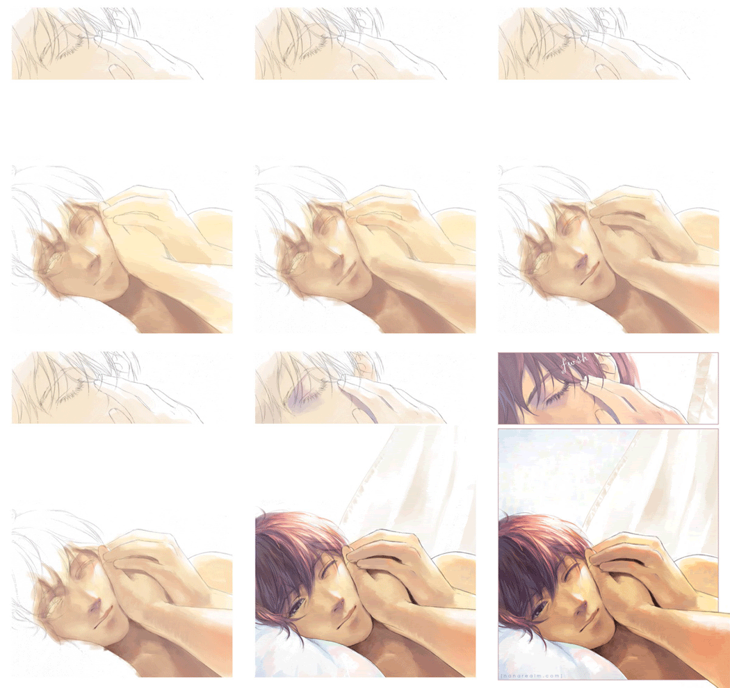
"Waking moment"


Some time ago the lovely Karen Lusted asked me to be a part of an artbook anthology that she was putting together. The artbook, Secret Colours, was not only going to showcase artwork from UK artists but also show steps in the image-making process.
I asked people on the Sweatdrop forums and on Deviant Art to come up with keywords or catch-phrases of what I should draw and later set up a poll for the final decision. The winning concept was "Waking moment".


I started out with doing a few rough thumbnails to explore the composition. After that I did a rough pencil in light blue over which a tighter pencil drawing was done as the final line art. The blue lines were easily removed in Photoshop, as described here.


The digital painting was done in Photoshop. Here's a small GIF animation showing different steps in the painting process.


Secret Colours can be ordered directly from Karen Lusted at karen_lusted@hotmail.co.uk. There's some more information about the book, including preview photos in her DeviantArt journal.


Sunday, 20 September 2009

Chiustream Caveman

Bobby Chiu over at Imaginism studios is doing a series of live painting sessions while filling up a sketchbook of his work that will be published. Meanwhile he invites people all over the world to paint along with him. A theme is chosen and the stop clock is set to one hour. At the end of the hour Bobby picks one of the paintings and does his own version of it.
Today the theme was 'caveman' so I decided to do a little art nerd caveman. The time given was 1 hour, but I started late so it probably ended up being 45 minutes.


It's quite amazing how the internet has transformed how we can interact with each other. Bobby Chiu is an amazingly inspiring and giving artist so if you haven't checked him out, DO!!

Where to find him:
Imaginism Studios
Imaginism Blog
Podcasts on Youtube
Chiustreaming on Ustream

Wednesday, 8 April 2009

Mid-day nap

A bit of doodling in ArtRage. I find the tools rather hard to handle, but the result sure is unexpected. This doodle started out as a black mark I made by accident when trying out the Wacom tablet shortcuts. I didn't bother to erase the black mark and in the end it grew to become the star of the show.

Friday, 27 March 2009

Devil's Tooth

Something from a dream last night. I rarely remember my dreams unless I go back to sleep after first waking up, which happened this morning. And I overslept.


The Devil's tooth marks the steepest point in a mountain range completely enclosing a hidden valley (think meteor crater), which is why (although it makes no sense now that I think about it) a lift system was built there.
There is a second part which I remember, which was more spectacular by far but it's too late to paint that now.

Time taken: ~ 30 mins

Thursday, 12 March 2009

Oily back

Speed sketch, 10-15 mins. Half used a reference image but mostly improvised.


Good night world!

Thursday, 5 March 2009

Gloomy swamp

It's been a while since I painted so here's a quickie. Time taken: 20-30 mins.

Sunday, 25 January 2009

2AM Blues

Another late-night paint sketch that started with throwing down some random brush strokes and seeing what emerged. It's a fun and spontaneous exercise.


Us humans are a narcissistic breed. We tend to see our likeness in the most abstract shapes (take Scott McCloud's example in Understanding Comics, a smiley for instance :) ), so it's probably not too surprising that it ended up looking that way to me and I reinforced what I thought I saw.


This dude was the end result. With this cropping I thought it looked a bit like a CD jacket.

The progress shot shows that the painting was started in the template I use for my work on Twelfth Night. I've been thumbnailing for the last few days. It's probably the most challenging and creatively demanding step in the comic creation process for me, but that also makes it the most rewarding. If the underlying structure is boring every step in the process to follow, from pencilling to inking to toning, will feel like a drag because I know that the page will be lacking no matter what.

---
Scott McCloud: scottmccloud.com
Understanding Comics: Amazon - Mandatory reading for any comic fan

Wednesday, 21 January 2009

Bizarre pair

A late-night paint sketch in Photoshop.
It started with random brush strokes which I kept building on until I saw something emerge. I was going to save some intermediate steps but forgot after the first one.


I was trying to make the global values read well, but I think the details ended up overshadowing the general composition. Maybe I started shading too early.
Time taken ~ 1.5 hours.

Wednesday, 24 December 2008

Merry Christmas!


The painting was done using a gradient layer set to Overlay over a greyscale painting in Photoshop. Final colour tweaks were made, trying to bring up the brightness and warmth using adjustment layers. This is the season to be jolly, after all!

Happy holidays! :)

Sunday, 14 December 2008

By candle light

Growing up in Sweden, there were plenty of opportunities to play in the snow. In order to make sure that I didn't loose my mittens in the cold, my parents tied them together using a long string which was thread in through one sleeve of the coat and out through the other so that they were always hanging off my sleeves.


Considering the number of gloves I've lost since I outgrew that method, maybe it's not such a bad idea...

Time taken, 45 min- 1 hour.

Sunday, 7 December 2008

Sargent copy

A copy of a portrait by John Singer Sargent, one of the great 19th century painters,

I decided to do a tonal study so the original painting was converted into grey scale. The time taken was about 2 hours, although as often is the case with paintings, most of it was done after just half the time. The last hour was spent tweaking the details to add that final touch of realism. The eyedropper was only used once at the beginning of the painting to find "black", i.e. the darkest shade, in the original.
It should be fairly obvious, but the original is to the left.


---
John Singer Sargent @ The Art Renewal Centre

Friday, 5 December 2008

Head painting

A free practice painting in Photoshop, without reference photo.
I suspect that I started refining too early. More shades on the rough block-in stage would probably have helped the final result.

Tuesday, 2 December 2008

Green ribbon

A speed painting in Photoshop. I had a go with some textured brushes. The time taken was probably a little over an hour. The main parts were in place after less than half that time, but quite a while was spent trying to tighten it up, especially the face. Unfortunately the end result lost some of the movement and fluidity compared of the rough block-in.

Sunday, 12 October 2008

Queen of Jupiter

This is a textured brush created from a photo of the bark of an ancient tree in the back gardens of the Forbidden Palace in Beijing. The origin of the tree is a nice little trivia, but what I found interesting was the rough texture.
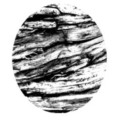

Photoshop's feature for creating custom brushes is a very powerful tool, but I still don't know how to fully utilise it. I created this wood grain brush as something to play around with and ended up using it in a somewhat unconventional way.
This picture was created exclusively using the wood grain brush and a simple palette of black and white.
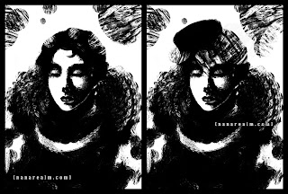

Usually I use brushes which have the 'Other Dynamics' box ticked in the brush settings, which allows some opacity variation for blending. However, I noticed that it damped the texture effect of the brush so I decided to leave it unticked. As a result every dab of the brush gives full opacity, i.e. black or white.
These were the settings I used for the brush. The only thing I varied as I got going was the Master Diameter, and occasionally the Spacing.
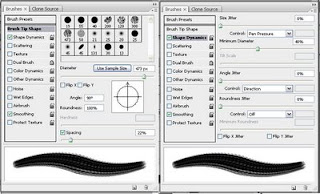

The main features of this brush is no opacity jitter and wide spacing, which makes sure that the texture comes through. It's also slightly oval, which gives some direction in the stroke. For example, the lace of her collar was done in a single stroke. Makes it seem simple doesn't it?
The time-consuming part was the face, since you can't be too rough while still making it look like a face.
Instead of using the brush in a conventional manner, I used it more like a sponge, creating shades by dabbing blacks and whites. By varying the brush size, the density of the 'holes' in the dab would change and I could thus lay down different tones. Then I would chip away with dabs of the opposite colour to refine the shape.
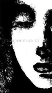


It may seem like a somewhat convoluted method, and sometimes it was quite difficult to get the right, but the end result was interesting enough to make it worthwhile.