Tuesday 30 September 2008

Rainy Nights

Back when I was taking my driver's license we were taught that a deceptively dangerous weather situation for driving is rain combined with darkness.
Normally the eye can largely adapt to the darkness of the road, but when the streets are wet the existing light sources are multiplied as well as spread out through their reflections. As a result, a wet night scene will take on a lot more brightness and colour than a dry night.
It's actually quite surprising how bright the night can become through reflections under the presence of only a few light sources. That being said, the reflected light tends to have a blinding effect on the eye, which makes it difficult to spot detail in the dark. Hence, one of the reason extra caution is advised to drivers on rainy nights. The other being the risk of slippery roads, especially at high velocities.


Image source: GettyImages

Friday 12 September 2008

Fish-eye and Curvilinear Perspective

Fish-eye lenses are used in photography to capture angles larger than the normal field of view of cameras. This means that the lens captures more of a scene than a standard lens, at the expense of some distortion. Examples where this can be useful are security cameras and "peep-holes" outwards on doors.

The fish-eye lens causes barrel distortion. This means that objects far from the centre of the lens becomes mapped into a smaller surface than those at the centre, thus giving rise to a spherical appearance.

A similar effect is explained more formally by curvilinear or 5-point perspective. It was discovered as early as the Renaissance and has even been suggested as an alternative (and perhaps more accurate) way of representing the way our eye sees the 3D world. A simple demonstration is given by Scott McDaniel in his explanation of 5-point perspective.


One of the arguments for the use of curvilinear over linear perspective draws from the observation that objects which are farther away laterally in our field of view will look smaller and smaller. Imagine a box in the middle of your field of view. Now imagine that box being moved farther and farther towards the right edge of your vision. Objects farther away look smaller, thus lending strength to the argument of curvilinear perspective.
However, this argument breaks down if considering that our field of view is relatively limited for any fixed point of view. The objects which would supposedly look smaller towards the periphery would not be captured by our visual field, or at least not in any clarity.

While it's true that curvilinear perspective is able to squeeze in more information about a scene into any single drawing than normal linear perspective, thus giving the viewer a feeling of "being there", Bruce MacEvoy explains that this is due to the combination of multiple viewpoints. I.e. as if your eyes or head was moving and taking in more information about the scene than any one viewpoint could give. According to MacEvoy, a single viewpoint is best represented using linear perspective. The curvilinear perspective can be viewed as originating from superimpositions of multiple viewpoints.


More information about curvilinear perspective by Bruce MacEvoy.
MacEvoy has a very informative site on Elements of Perspective. The Perspective in the World-section explains what perspective really is and is well worth reading for a more in-depth understanding.

Thursday 11 September 2008

What perspective?

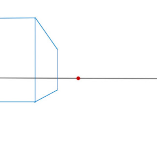
If you've ever tried to draw a very wide-angle shot in linear one-point perspective, you would notice how objects further away from the central vertical axis will look increasingly distorted. This is an effect which has caused great puzzlement to perspective beginners, such as myself.


This grid illustrates the wide-angle distorted effect in one-point perspective. The squares closer to the centre look perfectly in perspective, but the squares at the very end look strangely stretched.

Art classes, and even most perspective tutorials often seem to address the Hows of perspective-drawing, but rarely the When and Why.
As it turns out, the perspective you should use (most commonly one-, two-, three-point) depends entirely lot on what you're trying to draw and the viewpoint you're viewing the scene from.
For example, if you're viewing a house from quite a close distance and only seeing two corners of the house, the situation calls for one-point perspective.

On the other hand, if you stand back and view three corners of the house simultaneously, two-point perspective might be more appropriate.


If the vanishing points are placed too close to each other in two-point perspective a distortion effect will become apparent. Just as in the case of the breakdown of one-point perspective in wide-angle shots, two-point perspective is also situation-based.
In theory, the two vanishing points symbolizes the extreme peripheral limit of the field of view of our eye. An object which is very "large" in relation to the spacing of the vanishing points would mean that we are viewing the object from very up close. When we get too close to an object it will fill our entire field of view so that we can no longer see the it in it's entirety. I believe that's why a large object will appear distorted if it is "squeezed" into the field of view.

In the first wide-angle example, what would seem like a simple case of one-point perspective might actually be better represented using 5-point, or curvilinear perspective.


Tomorrow: Fish-eye view & Curvilinear perspective

Wednesday 10 September 2008

Airport sketch

Airports are great places to draw people. There are usually a lot of subjects to choose from and if you're lucky you might even find sleepers! People waiting tend to be bored though, so there is usually some amount of fidgeting, but someone will always be reading the newspaper or a paperback book.

This is my sister at Changsha Airport in China, from July this year. Unfortunately, sleepers move occasionally as well. In this case she moved her arm just as I was in the middle of drawing it.

Tuesday 9 September 2008

Thumbnail designs

Inspiration can be unexpected.
Recently I was flipping through a folder with artwork by artists I admire and this particular folder caught my eye. The bottom left thumbnail looked a girl with long braids, wearing a big black hat and baggy black and blue trousers, thrusting forward into empty space.
With the details being too small to see, I couldn't be sure what the actual image was supposed to depict but I decided to put my own idea down on paper...


... which resulted in this character.


The thumbnail was of a piece of art by Korean concept artist Hyung Tae Kim. Clearly it was not what I had imagined it to be, but it shows how amazing your mind can be in finding meaning where things are unclear.


Instead of hoping to find that random small image, drawing your own thumbnails is common method used by concept designers to spark their creative juices. The human mind is very sensitive to silhouettes, so the low detail thumbnail can feed your brain with raw ideas in their simplest form.
The Skillful Huntsman is a concepts art book that showcases the creative process for character, vehicle and environment designs by three ex-Art Centre College of Design students. The thumbnail method is used extensively and masterfully to explore possibilities before a final version is chosen.

My own first go at using thumbnails for character design did not yield as much variation as I wanted, but there is definitely much potential in the method.


More information about Hyung Tae Kim: Hyung-taekim.org
Example pages from The Skillful Huntsman: Design Studio Press

Monday 8 September 2008

Mysterious wind

A common "trick" for creating dynamic images is to introduce flowing elements, such as long hair, ribbons, bits and pieces of clothing, flower petals etc. Even in a boring indoor conversation you can liven things up and create atmosphere by drawing these elements as if moved by some mysterious force. It's can be a form of abstraction, but people rarely complain.


Drawings of something happening is usually a lot more interesting than something static, even if the only thing happening is hair flowing in the wind.

Check out more of CLAMP's work for masters of hair manipulation.

Sunday 7 September 2008

The art of copying

Bargue drawings have been used by classically trained artists as a means for learning principles of line and tone, by copying so called Bargue-Gerome plates.


Created by Charles Bargue and Jean-Leon Gerome in the 19th century, the original lithographs were a part of their influential drawing course Cours de Dessin, which has been very popular among academic artists. A notable follower is Vincent van Gogh who copied the plates more than once and is rumored to have greatly benefitted from it.
The Bargue plates depict classical sculptures and reproductions of the lithographs are meticulously copied by the student. Many hours are spent on achieving a perfect replica of the original drawing. The process is supposed to sensitise the student to line, tone and shape through careful observation.

This learning method caught my interest as it reverberated somewhat with how I, and many others got started with drawing. Although I never copied any fancy 19th century reproductions of lithographic plates, I believe that copying my favourite artists served a similar purpose to that of Bargue drawings.

Various advice is given to people who are just getting into drawing through manga. Some say you shouldn't copy, because you don't learn anything about how to construct the human body independently. While this is true, there is another value in copying.
Something which I found highly attractive about the early manga I found (think CLAMP) was the clean and smooth line work. I found it fascinating how a single line could convey both energy and stiffness. By copying artwork in these mangas I was able to gain a feel for the quality of line and thus get rid of some of the wobbliness and fuzziness which beginners tend to suffer from.

This is probably my first attempt at manga-influenced drawing, it dates back to 2001. It's a modified copy of a CLAMP drawing. The original had long flowy hair which I could not hope to handle at the time so I made it easy for myself. The fuzzy line quality shows my struggle with keeping a steady hand and creating smooth and dynamic lines.


More info about Bargue Drawings: Learning to see
Image from the Dahesh Museum

Saturday 6 September 2008

Impact panel

An impact panel should convey a strong sense of action. To this end, speed lines are used often, but there are other ways to make a panel more dynamic.

This is the original hand-inked panel for an impact panel I drew recently.
Curved speed lines have been drawn to show the direction of the action of the hand and small explosion-like lines have been drawn around the area of impact. A big sound effect conveys the strength of the impact.
Small pieces of debris have been added as extra dynamic elements. A common trick when drawing impact and action panels is to arrange pieces of debris or other flying elements in a way that follows the direction of the action in the panel. Here the debris originates from the punch, so the direction of action is outwards from the hand.


While there is a sense of impact is present in the original inks, I further improvements were made digitally. Focus lines were added in Manga Studio and more pieces of debris were drawn long the direction of the focus lines.
For those who are interested in small details, in the original inks a piece of debris has one square side perpendicular to the impact lines (the big one underneath the 'A'). I felt that instead of helping the action, the perpendicular side hemmed the flow, so I changed the shape of the debris in the panel below.

A big thing that needed more work was the sound effect. A simple outline is neither particularly dynamic nor contains any weight or impact, so it needed to be filled. Instead of using solid black I chose to once again follow the focus lines of the panel, making the sound effect a part of the action.