


Wednesday, 22 December 2010
Wednesday, 15 December 2010
Fire mage
A random sketch that looked like a witch at first but took a slightly different direction.

Monday, 6 December 2010
Ross Noble tour poster
Last Friday, comedian Ross Noble was performing in the Cambridge Corn Exchange. I'm not generally that into stand up comedy but in this case we had a particular reason to go and see him.


Earlier this year I got the gig to do the artwork for Ross' Nonsensory Overload tour poster. I didn't know much about him before this so I had to do some research. Ross' shows seem largely improvised and he constantly feeds off little oddities and quirks that he finds in the audience. That unfathomable mind of his manages to make the most unconventional associations, of which he will happily paint you a vivid picture, usually resulting in surreal hilarity. This makes for a very random and bizarre comedy experience and it was this randomness that Ross wanted to show in his poster.
The idea for the poster was wholly Ross'. He already knew that he wanted a picture of his face with his long, crazy hair twisting and morphing into all kinds of random objects from past jokes.
In the beginning it was important to get a clear idea of what Ross had in mind was so I sent over a few different sketches with different levels of stylisation of his face. I felt that since he has such a distinctive look it would be a shame to make things too stylised, and indeed, the version that we decided to go with in the end was the most "realistic" one. After that it was just a matter of watching through a bunch of Youtube videos and noting down the random things said that could be used in the artwork. It was an unusual but fun experience to find yourself drawing owls in nightcaps, squids with foam fingers, feather-duster emus... not to mention the bum-faced kids. Gotta' love 'em bum-faced kids.


The colouring was probably the most challenging part since there were so many separate elements that needed to stand out. Normally I gravitate towards more muted colours so it was hard to figure out how to use a bright, crazy palette. I ended up going in circles and getting nowhere, but luckily there was a colour lover in the house. Chloe Citrine, my housemate, is great at coordinating bright colours and she quickly spotted the grave that I had dug myself into and suggested the solution.

The artwork was finished in April and to be able to see it used as intended now, towards the end of the year, is a great treat. Apart from posters and flyers, an animated projection of the artwork was shown on the curtains before the show started. When the curtains dropped, so did my jaw. A giant, colourful air castle made up from Ross' joke topics had been erected (or rather inflated) on stage and I could spot some of the elements that were used on the poster.


After the show we got to go backstage and meet Ross, which was awesome. I didn't communicate with him directly as the artwork was created so being able to get the approval from the man himself was the ultimate closure. It turned out he had even used parts of the artwork on the shoes that he wore on stage, how awesome is that?


I really appreciate the time that Ross and his crew made for us after what must've been an exhausting show. Ross is practically doing a performance every night in what must feel like a maddening marathon. He's a super nice and, despite what you might think based on his comedy, down-to-earth guy when you get chatting to him and seemed quite interested in comics. Do check him out if you get a chance, it's a surreal experience. :)
I feel incredibly lucky and privileged to have been trusted with bringing Ross' idea to life. It's not the type of commission that comes knocking every day and it's turned out to be an incredible experience. Freelancing might have its downsides, but it certainly also has it perks!
In the beginning it was important to get a clear idea of what Ross had in mind was so I sent over a few different sketches with different levels of stylisation of his face. I felt that since he has such a distinctive look it would be a shame to make things too stylised, and indeed, the version that we decided to go with in the end was the most "realistic" one. After that it was just a matter of watching through a bunch of Youtube videos and noting down the random things said that could be used in the artwork. It was an unusual but fun experience to find yourself drawing owls in nightcaps, squids with foam fingers, feather-duster emus... not to mention the bum-faced kids. Gotta' love 'em bum-faced kids.

Rough and cleaned up drawing.


I was thrilled to see that the artwork was also printed on all sorts of merchandise. Signed posters were sold at the show for the charity Riders for Health (Ross is a big motorcycle buff). I hope that the art helps to sell them lots of posters!

After the show we got to go backstage and meet Ross, which was awesome. I didn't communicate with him directly as the artwork was created so being able to get the approval from the man himself was the ultimate closure. It turned out he had even used parts of the artwork on the shoes that he wore on stage, how awesome is that?


I feel incredibly lucky and privileged to have been trusted with bringing Ross' idea to life. It's not the type of commission that comes knocking every day and it's turned out to be an incredible experience. Freelancing might have its downsides, but it certainly also has it perks!
Monday, 29 November 2010
Twelfth Night - alternative US cover
Abrams publishes SelfMadeHero's Manga Shakespeare titles across the Atlantic and I was given the chance to do an alternative background for the cover of the US version of Twelfth Night.

Originally I modelled the landscape in Twelfth Night on the dramatic mountains and valleys of certain regions of Switzerland and once I told my father that I'd love to go travelling there. My parents now live in Norway and my father, who's been to Switzerland, scoffed and said that I didn't even have to cross the border to see that kind of landscape.
When I redid the background for the cover it was not long after I'd visited the beautiful Geiranger fjord, just a few hours' drive from my parents' town, and that proved immensely helpful. Often I find that the most frustrating and time-consuming part of painting is searching for that something that you can't quite grasp, probably because of a lack of understanding or knowledge of what you're trying to paint. In contrast, when you have a clear idea of what you want you can avoid a lot of false leads and pitfalls, and shoot straight for that image in your head.


The memories of the fjord were put well to use when visualising the colours and atmosphere for the painting and it was an enjoyable and surprisingly agony-free experience to paint.
I'm not sure which version of the cover I like the best. I like showing the landscape in the US cover, it adds to the story, but the title and the characters stands out more in the original cover.

Originally I modelled the landscape in Twelfth Night on the dramatic mountains and valleys of certain regions of Switzerland and once I told my father that I'd love to go travelling there. My parents now live in Norway and my father, who's been to Switzerland, scoffed and said that I didn't even have to cross the border to see that kind of landscape.
When I redid the background for the cover it was not long after I'd visited the beautiful Geiranger fjord, just a few hours' drive from my parents' town, and that proved immensely helpful. Often I find that the most frustrating and time-consuming part of painting is searching for that something that you can't quite grasp, probably because of a lack of understanding or knowledge of what you're trying to paint. In contrast, when you have a clear idea of what you want you can avoid a lot of false leads and pitfalls, and shoot straight for that image in your head.


If you ever visit the fjords, make sure to pack warm clothes. It gets surprisingly nippy, even in the height of summer. This was July.

The memories of the fjord were put well to use when visualising the colours and atmosphere for the painting and it was an enjoyable and surprisingly agony-free experience to paint.
I'm not sure which version of the cover I like the best. I like showing the landscape in the US cover, it adds to the story, but the title and the characters stands out more in the original cover.
Sunday, 28 November 2010
Ikea Man

A doodle done while video chatting. I thought he might be a savannah explorer at first but the stripes on the tie suggested otherwise. His distant gaze turned into a puzzle over what to have for lunch.
Wednesday, 17 November 2010
Second Sky characters
These are the main characters from Second Sky, the comic that I'm working on right now, written by the talented Mr Fehed Said. It's a comic that has been "in development" for a long time without really getting anywhere, the problem being entirely my own, but things are finally starting to pick up and I can't wait to share some pages with you soon.
The comic has given me quite a few challenges to tackle. The first and most important one being the character designs, which I felt needed to be different from anything I've done before. August's design went through the most revisions. A 36-year-old Asian delivery man is surprisingly hard to pin down.
August Zhao

May Zhao

Popo

Monday, 1 November 2010
MCM expo haul
This last weekend was another MCM expo and I shared a table with John Aggs on Saturday (who has a just started a new developmental blog for his personal comic, Liquid City) and Belinda Leung on Sunday. I met Belinda at the MADE art symposium in Berlin this summer and hadn't seen her since so it was particularly nice to catch up. :)


Last expo didn't leave me any time to do shopping so this time I wanted to correct that, but still managed to fail at planning and ended up having to cram all the shopping into the last 45 mins before closing on Sunday. Thus, the expo haul is not big, but oh so sweet.

Firstly, I need to plug Paul Duffield's new self-published artbook/visual poem/narrative Signal. The artwork is beautifully emotive and captivating. If I could I would want to stick every spread on my wall. The book is a string of wordless narrative - part comic, part artbook, all gorgeous.
I also bought some beautiful art prints and postcards from Zarina Liew and Yuri Kore, both whose art I absolutely adore.
Nikki Stu is a new discovery who amazingly lives just up the road from me. Her comic was packed in a brown envelope and reminded me of why I love home-made stuff.
And here's another great find, Kenji from Naoki Urasawa's 20th Century Boy. Spot on dude!

Big thanks to everyone who came by and bought books, prints and commissions. Love you all! :)
Thursday, 7 October 2010
Cambridge Coffee'n Sketch
Last month saw the first Cambridge creatives' meet happen at Clowns café for the first time. The original idea was to get those of us who work from home a good reason to put on some decent clothes, leave the house and go out and interact with other humans at least once a week but of course, anyone is welcome! :)

The meets are on Wednesdays, from 2-6pm at Clowns Café in King Street. People can drop in or leave when they feel like it, it's quite informal. :)
For updates on the meets, see the Cambridge Coffee´n Sketch Facebook page.
Sidetracking... That photo was taken with my new DSLR which was broken in at today's meet. It's a Nikon D3100, fitted with a Tamron 17-50mm f/2.8 lens. It's a marvellous little piece of technology! I'm loving being able to take pictures with short focus and play around with the light settings.
Friday, 1 October 2010
Leon

Luc Besson's Leon (The Professional) is a brilliant movie with iconic characters. I watched it for the first time the other day. Should've done it years ago.
Tuesday, 28 September 2010

Thursday, 23 September 2010
Backyard

There were some great, low-hanging clouds in the sky this afternoon.
This epic cloud in our backyard made me stop dead in my tracks. The massive formation towered above our house like a mountain, the scale reinforced by the bush in the foreground. I tried to remember as much as I could about the colours and values, before doing this quick memory painting. The subtle warmth in the clouds from the afternoon sun is often lost in a photograph.
This epic cloud in our backyard made me stop dead in my tracks. The massive formation towered above our house like a mountain, the scale reinforced by the bush in the foreground. I tried to remember as much as I could about the colours and values, before doing this quick memory painting. The subtle warmth in the clouds from the afternoon sun is often lost in a photograph.
Tuesday, 21 September 2010
Round-hair girl

Finally, universities are starting here in Cambridge. I can't wait to do some figure drawing again. I believe Anglia Ruskin does an evening session, although I need to find out what day and time it is. Cambridge University terms don't start until early October, but once they get going I'll try to make the Architecture Society sessions again.
Tuesday, 7 September 2010
Chameleon boy & Red scarf girl
I managed to get hold of an Intuos3 A3 on Ebay so I had a go at digital inking. It was definitely easier with a bigger tablet, although I still think that traditional inking is something I want to continue to work on.


The scarf set the tone for the rest of the outfit. That type of red scarf was worn by youths during Mao's cultural revolution. I don't know if they're still used in this day and age, but for a long time they were worn in schools as a sign of distinction.
The slogan on this propaganda poster has been so re-iterated to most Chinese as they were growing up that it's become somewhat of an in-joke, often told in English in its direct translation.
"Good good study, day day up."
You get the idea. :)
Sunday, 22 August 2010
How to simulate a large graphics tablet
For those that are thinking about upgrading their graphics tablet, yet are unsure about what size that would suit their needs best, there's a simple way of emulating the feeling of drawing on a larger tablet. If you already own a Wacom, the Mapping function, which comes with the tablet software, allows you to do this. By mapping your tablet to a smaller portion of your computer screen, it gives a similar effect as drawing on a section of a larger tablet. All that’s needed is a bit of maths.


- Tablet measurements. Find the dimensions of the Active Area of your current tablet and of the larger tablet that you want to simulate. This can usually be found in the spec sheets for the tablet.
- Resolution. Note down your screen resolution. (You can find your screen resolution by right-clicking on an empty area on the desktop, choose Properties and then Settings.)
- Mapped resolution. The resolution of the mapped area (in pixels) can be found simply through the ratio of the smaller tablet to the larger tablet.
Mapped width in pixels = (Width of current tablet) / (Width of simulated tablet) x (Screen width in pixels)
Just substitute Width for Height to find the mapped height in pixels.
So for example, I have an Intuos3 A5 Wide (271 x 159 mm) and I'd like to simulate the Intuos4 XL (488 x 305 mm). My screen resolution is 1680 x 1050 pixels. By plugging in the numbers I find that the screen area that my A5 Wide should be mapped to is 932 x 547 pixels.
- Change Tablet Properties. Now, open up Wacom Tablet Properties and select the Mapping tab. Under Screen Area select Portion… and you’ll get a pop-up. In the Enter Coordinates field, put in the new dimensions. You can then choose what portion of the screen to use by moving the red box in the little screen diagram.

I used this method to compare the feeling of drawing on my current tablet, the Intuos3 A5 Wide, to drawing at the size of an Intuos4 Large and an Intuos4 XL tablet.
The Intuos4 Large is not that much bigger than an Intuos3 A5 Wide and as predicted, drawing at the Intuos4 Large size really didn't feel all that much different from the A5 Wide. The Intuos4 XL on the other hand is a different story.
These doodles were drawn at my screen resolution (1680 x 1050) with no zoom using the XL-mapping, L-mapping and no mapping respectively. It might not be obvious, but I felt much more in control of the lines with the XL-mapping. My hands did have to make larger movements which could be tiring in the long run, but you can always zoom out if you want less precision.

I've never found pencilling and sketching on the computer particularly enjoyable, probably because of the lack of control compared to sketching on paper. After having felt what it's like to draw on a much bigger tablet I think it might be worth investing in an upgrade though. It would be great to have the Free Transform tool and Cut & Paste functions at hand, and setting up perspective guides is ten times easier in Photoshop than on paper.
Friday, 9 July 2010
Ghost Hunter designs
These are some designs I did for a mock project called 'Ghost Hunter'. The project was a part of a concept art course run by Leo Sandberg at the University of Gotland last summer. Leo is an amazingly multifaceted artist and a great teacher. It was a privilege to be able to learn from him.


---
Leo Sandberg - Link
University of Gotland - Link


---
Leo Sandberg - Link
University of Gotland - Link
Thursday, 8 July 2010
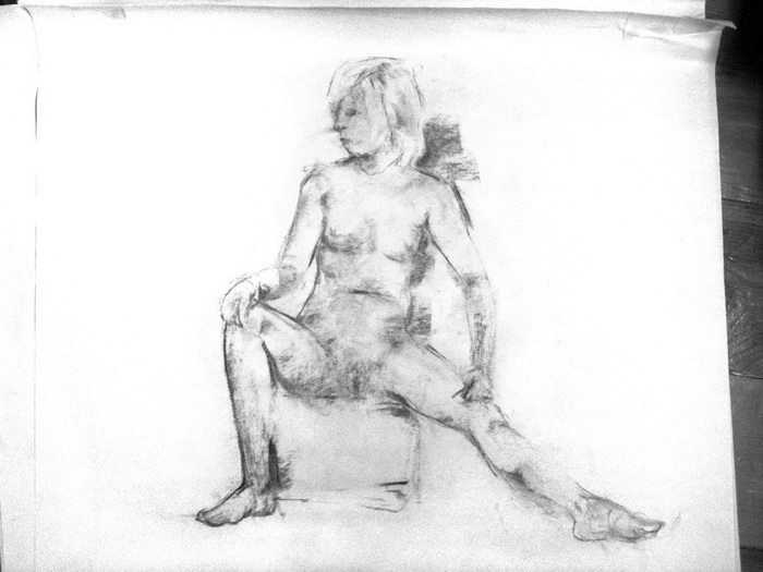
Recent Life drawings
It's been a while since I last did proper life drawing and it's hard to find classes in the summer, but I felt a strong need to get back into it so yesterday I splashed out on a slightly more expensive class than the ones I've been to in the past (previous post).
I've been trying to move away a little bit from the construction method à la Glen Vilppu. Vilppu's method is excellent for drawing figures from your mind and I'm still using it, but I think there's benefit in learning more approaches to drawing.
I need to give my mate John Aggs a great thanks for getting me Henry Yan's figure drawing book. Henry Yan has been a great source of inspiration for how to use charcoal, as has Nathan Fowkes.


---
Mark Rigby's Life drawing classes - Link
Hills Road Sixth Form College art & design classes - Link
St Barnabas Press - Link
I've been trying to move away a little bit from the construction method à la Glen Vilppu. Vilppu's method is excellent for drawing figures from your mind and I'm still using it, but I think there's benefit in learning more approaches to drawing.
I need to give my mate John Aggs a great thanks for getting me Henry Yan's figure drawing book. Henry Yan has been a great source of inspiration for how to use charcoal, as has Nathan Fowkes.


My favourite from this session is probably this last one. It was one of the shorter poses, 5 mins, but I think enough information is suggested to make it readable and the pose ended before I could screw it up too much. When given longer time there's more of a risk for over-working the drawing.
I find it difficult to get the value relationships right. It's very easy to make something darker or lighter than it should be. I've heard that squinting is the trick but it's hard to see the right things.
Now that term is over it's become quite difficult to find cheap life drawing classes in Cambridge. The class I caught yesterday is run by Mark Rigby and it was unfortunately the last one for this summer. The next batch of classes start on the 8th of September. The class was held in St Barnabas Press on Coldham's Road. The building is a printing facility, mostly for artistic prints, and they also offer small studio spaces for artists.
These classes aren't cheap - £17 per session, but materials and easels are provided and the sessions are fairly long (3 hours, with a short coffee break). This particular class was not taught but Mark also teaches at the Hills Road Sixth Form College, and those classes are more structured.
---
Mark Rigby's Life drawing classes - Link
Hills Road Sixth Form College art & design classes - Link
St Barnabas Press - Link
Wednesday, 26 May 2010
London Expo & Dino-Saw-Us!
London Expo is upon us once again! I'll be there both days this weekend (29-30 May). I'm bringing copies of Twelfth Night which I'm happy to sign and sketch in, prints and a few very limited edition postcards made from the Chinese New Year and the Showgirl pics I drew a while back. Of course, I'll be doing commissions and portraits as well.
You play by simply picking up a blank passport booklet at Expo (or print one out yourself) and then you find all the people with stickers. I hope there's time for me to go sticker hunting as well... I really want some stickers... Gotta catch 'em all!!
Hopefully this will become a reoccurring Expo activity that will yield a different collection of stamps each time. I can see the passports becoming collectors' items, and it's a great way to make some new friends!
Find out more about how to participate and who's got stickers on the Dino-saw-us blog.

My stickers arrived today and they look great! I almost want to keep them to myself but I'll give them up if people come and say hi at our table!
I'll be sharing table C17 with Amanda in the Artist Alley. There are quite a few new names on the list so it will be fun to see this incarnation of the Artist Alley. Floor plan here:


Hope to see lots of people at Expo!
---------------
London Expo - Link
Dino-Saw-Us - Link
Previous post: Expo portraits - Link
Table buddy: Amanda Elanor Tribble - Link
Subscribe to:
Posts (Atom)