Wednesday 24 December 2008

Merry Christmas!


The painting was done using a gradient layer set to Overlay over a greyscale painting in Photoshop. Final colour tweaks were made, trying to bring up the brightness and warmth using adjustment layers. This is the season to be jolly, after all!

Happy holidays! :)

Sunday 14 December 2008

By candle light

Growing up in Sweden, there were plenty of opportunities to play in the snow. In order to make sure that I didn't loose my mittens in the cold, my parents tied them together using a long string which was thread in through one sleeve of the coat and out through the other so that they were always hanging off my sleeves.


Considering the number of gloves I've lost since I outgrew that method, maybe it's not such a bad idea...

Time taken, 45 min- 1 hour.

Monday 8 December 2008

On Sargent...

Yesterday I posted a copy of a painting by famous 19th century artist John Singer Sargent (1856-1925). A greatly successful portrait painter and muralist even during his lifetime, his popularity survives until this day.

I initially stumbled across Sargent's name while trolling the depths of the ConceptArt.org forums, where I found him frequently mentioned with great reverence. A quick search for his work reveals why. One of the first works I found by him, El Jaleo, left a strong impression. The gracefulness and dramatic lighting creates an enchanting mood.


Finding Sargent so frequently mentioned on the ConceptArt.org forums is no coincidence, I reckon. Sargent is well known for his genial choice of colours, allowing for a seemingly effortless ability to capture the essence of a picture through a few brush strokes.
This is best felt when looking at thumbnails of some of his paintings, which look perfectly rendered from afar, but when zooming in it can be seen that the brush strokes which make up the picture are surprisingly coarse.


In today's entertainment industry there is a high demand for large quantities of conceptual work, supplied by artists such as those found on ConceptArt.org. Apart from quality, speed is an important skill required from these artists. The need to communicate as much as possible, as effectively as possible makes artists like Sargent excellent to study.
A contemporary master of the art of using a little to communicate a lot is Craig Mullins. His resumé includes concepts for franchises like Final Fantasy, Harry Potter, Age of Empires and James Bond.


---
John Singer Sargent @ ARC
ConceptArt.org
Craig Mullins - GoodBrush.com

Pictures courtesy of ARC and GoodBrush.com

Sunday 7 December 2008

Sargent copy

A copy of a portrait by John Singer Sargent, one of the great 19th century painters,

I decided to do a tonal study so the original painting was converted into grey scale. The time taken was about 2 hours, although as often is the case with paintings, most of it was done after just half the time. The last hour was spent tweaking the details to add that final touch of realism. The eyedropper was only used once at the beginning of the painting to find "black", i.e. the darkest shade, in the original.
It should be fairly obvious, but the original is to the left.


---
John Singer Sargent @ The Art Renewal Centre

Friday 5 December 2008

Head painting

A free practice painting in Photoshop, without reference photo.
I suspect that I started refining too early. More shades on the rough block-in stage would probably have helped the final result.

Thursday 4 December 2008

Victorian & Edwardian Photographs

This was the find of the day - an image archive with hundreds of vintage photos. I especially liked the ones of people with outrageous bicycles. You have to wonder what the big idea with those was...

Victorian & Edwardian Photographs - Roger Vaughan Personal Collection


Another incredibly cute find... This 9-year-old boy, Alec Greven, has an early start on becoming a serious ladies' man. The book he wrote, How to Talk to Girls, is illustrated by Kei Acedera from Imaginism Studios.

Tuesday 2 December 2008

Green ribbon

A speed painting in Photoshop. I had a go with some textured brushes. The time taken was probably a little over an hour. The main parts were in place after less than half that time, but quite a while was spent trying to tighten it up, especially the face. Unfortunately the end result lost some of the movement and fluidity compared of the rough block-in.

Monday 1 December 2008

I just wanna live

Overheard at Clowns, a popular café in central Cambridge.

Sunday 30 November 2008

Tezuka's Paneling

Osamu Tezuka is often hailed as the God of manga. It's taken me a good while to start reading his work but so far I've been pleasantly surprised. As old as these things are, the stories are still relevant and they read pretty well. It's easy to see why they changed the face of manga back then.

Tezuka is known for being pretty experimental for his time. Recently I've been reading his Ode to Kirihito. Most of the book has a very clear panel layout and narrative but these two pages stood out a bit. Nowadays this type of irregular panelling would hardly raise a brow, but I wonder if it would have been perceived as pretty out there back when it was published in the 70's.


The question is how effective this kind of jigsaw type of panelling is. I find myself struggling to figure out in what order the panels are supposed to be read. It could be argued that since these panels are used in a collage fashion to give you a visual blast, it doesn't really matter. As interesting as it may look, the fact that you have to stop and think about how to read it defeats the purpose to me.
It could be that the purpose of the creator is to generate a sense of psychological unease, in which case I think this type of paneling would work pretty well, but having read these two pages in context, neither warrants large amount of unease.

It can be a challenge to balance between interesting page layouts and readability. Paul Duffield and Kate Brown did great jobs on this for SelfMadeHero's Manga Shakespeare line - their titles are The Tempest and A Midsummer Night's Dream respectively.


Being Shakespeare, the beautiful and often abstract page layouts compliment the poetical language. At the same time, the narrative is kept flowing steadily so the reader can immerse themselves in the story.
(And for the record, I'm not just saying this just because I happen to be working on a title of my own.)

---
Paul Duffield - spoonbard
Kate Brown @ Deviantart
Manga Shakespeare - SelfMadeHero

Saturday 29 November 2008

Twelfth Night for SelfMadeHero

Since October, and for the next couple of months onwards, I've been working full time on the graphic novel adaptation of Shakespear's Twelfth Night for SelfMadeHero's Manga Shakespeare line. It will end up as 193 black & white comic pages and 9 coloured character pages. The colour pages are already done and I'm working on the first batch of pages from the abridged script. Sadly I can't show any work in progress at the moment but the cover and some information about the title has been released on SelfMadeHero's website.


Fast food chains, sale labels, road signs - things that are designed to steal your attention tend use the primary colours, red, blue and yellow. I decided to apply similar reasoning for my cover design. Each character is dominated by a primary, but it's not quite as eye-catching as say, a Burger King sign.


The composition is simple but I hoped that it would read more easily this way.
There were about 10 alternative cover thumbnails of varying complexity, but in the end it was the very first one that I drew that got chosen. Perhaps that says something about that first intuitive idea you have when given a new assignment.
For the same reason I find it very difficult to keep my comic page thumbnails rough. The strongest imagery come from the first time I immerse myself in the a script, so I tend to put down little details before I forget them. On one hand it's good in that the first impression is preserved but on the other hand it makes me more reluctant to scrap things and start over from scratch, which is needed sometimes.

Friday 28 November 2008

Friday life drawing

Today was the last session for this term. Once again, we had a male model.
I think my focus was not as good as last time. It was quite hard to see things with an analytical eye. No excuses, but I wonder if the fidgety and bored-looking model could have had something to do with it.


The Cambridge University Architecture Undergraduate Handbook strongly encourages first years to attend these sessions. At the end of the class I asked one of the architecture students about how life drawing was supposed to help them in their studies. He didn't seem to be quite sure himself. I can imagine that architectural drawings must be quite different from life drawing, but perhaps this enforces the idea that life drawing is a strong basis for any kind of art.

Thursday 27 November 2008

Dancer

Usually I use mechanical pencils, but recently I bought a pack of medium soft Derwents for life drawing class. I never realised traditional pencils had such potential. It's ironic, considering it's usually he first writing/drawing medium given to you as a kid.

By gripping the pencil from above and using the entire arm instead of just the wrist I felt that it was a lot easier to create fluid lines. The size of the paper is A4.

Wednesday 26 November 2008

Sketches from China

A sketch I made while I was in China this summer...


It's from the Tang Dynasty Cultural Park in Xi An. The park is an artificial reconstruction of what the Tang dynasty supposedly would have looked like, so the impressive-looking buildings have no historical value. They are very shiny though.


The weather had been extremely hot and stuffy that day, but as dusk approached a rain cloud breezed past in the distance. For a moment the light took on the golden sheen which contrasted nicely against the dark clouds in the distance. Even though we didn't get any of the cooling rain, the wind took most of the heat away so it was a great evening to spend in the beautiful and uncharacteristically empty park.


Tuesday 25 November 2008

Setting goals

Many people who list manga as their prime, perhaps even only influence are quite young when they start drawing and do it mostly for fun. Speaking from personal experience, when I started out all I wanted to draw was "manga-people". My parents, once they noticed my new hobby, sensibly suggested that I should try studying real people but I would turn my nose up at the thought - real people weren't pretty!

For a few years I learnt by copying and studying other manga artists and in the beginning the improvement was quite rapid. Learning the box & ball anatomy took some effort... folds quite a while, and don't get me started on the hands, but eventually things started to shape up.
Now, the first few years were great, every other new drawing I was drawing something for the first time and I had fun improving. But after that, things plateaued. When I started my goal was to learn how to draw pretty manga pictures. So what do you do when your pictures start looking pretty? Personally, I stopped improving.

That being said, not everyone aims for constant improvement. Drawing for fun is fine, more than fine, terrific! It beats shopping or drinking your allowance away if you ask me.
My point is, if you are looking to improve your art, whether it's for fun or dead serious - being aware of where your goals lie is a very good idea. At that time I thought I had reached my goals, and for the time being I had.
A few years later I found new goals and started bashing myself for having stopped improving but looking back now I'm realising that it was a matter of maturity. Your frame of mind grows just as you do so there's no point in regretting lack of insight from those early days. The best thing to do to avoid stagnation is to make sure that you keep on developing your art as well as your mind.

Monday 24 November 2008

Mushroom Fighter!

Saturday was mine and Faye's workshop on "Designing your futuristic manga hero" at the Victoria & Albert museum.
We decided to approach the subject by showing that inspiration for outlandish character designs can be found just about anywhere. Google image search provided some random imagery and I did a pre-design on the train to London...


... after a quick breakfast. I swear, these make me look forward to train journeys.


Can you spot all the images used in her design? It shouldn't be too difficult.

The backstory involves a future where humans are cultivating space mushrooms which are in constant peril of being garbled up by giant grasshopper-like aliens. Our heroine is a pestilence fighter, wearing a lethal chemical pack and brandishing a set of anti-pestilence emitters, whose light repel any hoppers which might sneak up on her from the back.

Right. Maybe it's not an award winning design, but you get the idea.
The second point we wanted to make in the workshop was that a world and a back story is essential for a believable character design.

Friday 21 November 2008

Life drawing at The Shop

Fridays 2-4 pm, The Shop, Cambridge is on my agenda from now onwards for life drawing sessions.
Today was the second time I went and we had a male model, which apparently is quite rare. Whenever I've been to life drawing so far it's been pretty evenly distributed between male and female models, so I'm guessing my sampling population is still too small.


The life drawing classes are organised by the Cambridge University Architecture Society and is open to the public. Each session is a mere £2 for members (anyone can join for £15) and £4 for non-members.
The sessions are quite informal. There is a teacher who will dictate the length of the poses and suggest things to focus on, but you are also free to do your own studies. Drawing material is supplied, but today I grabbed my own pad since I find huge sheets of loose paper hard to handle.

It 's interesting how the first drawing of the day turned out rather badly, but how things got progressively better. It's a bit like exercising I guess, warm-ups are needed.


Most of the poses were around 5 minutes. These are roughly in the order they were drawn.


If there's something I don't get it's blind drawing, where you look only at the model and not at the paper. The teacher was introducing it as a way to loosen up and get some new marks down. We were also encouraged to use out left hand. When it comes to blind drawing I found that it doesn't matter what hand I use, the result ends up the same, which is pretty interesting.
The final pose was 25 minutes.

At the moment I have quite a hard time controlling the medium - charcoal in particular, since I have almost no previous experience with it. You can get some nice subtle shades with charcoal by smudging it, but for me it ends up rather messy. Also, drawing big seems essential. With my sligtly-larger-than-A4 sketch pad it was difficult to do any renders at all with charcoal.
Instead, I found it easier to use a soft 6B pencil, only I forgot to bring a sharpener so it quickly got worn down.

Friday 14 November 2008

The Shop - Cambridge Open Art Space


The Shop is an open art space and meeting point for artists in Cambridge, run by a group of volunteers. Apart from life drawing sessions (which is linked to the Cambridge University Architecture Society) it hosts other workshops (Cambridge Comic Creators Collective, a.k.a. C4, for one) and also yoga and dance classes.


It's a great art space and for a insignificant membership fee of £6 (£12 if you've got a steady job) you can use the venue and the materials it freely. The life drawing sessions are by far the cheapest I've been able to find in Cambridge.

I was told by one of the people behind The Shop that the premises are owned by Jesus College. It has been let on a short term basis until it will supposedly be turned into a hotel in two years time.
The place itself is not huge. As far as I've been able to gather, there's only one main work area, but it's large enough to accommodate for a life drawing group of 20-25 people quite comfortably.

Did I mention they have a tea corner as well? What more do you need?


The address is:

18 Jesus Lane,
Cambridge CB5 8BQ

It's located smack in the centre of Cambridge which makes it very easily accessible for people in the area.

More information about The Shop and an activity schedule can be found on their homepage.

The Shop

Saturday 1 November 2008

Space doll and V&A workshop

The futuristic designs in this sketch wasn't intentional at first, but as the figure was laid down I realised that it couldn't hurt to brush up those scifi sensibilities since I'll be co-running a workshop on the theme of 'future' later this month.

Scifi is not really a genre I'm very invested in (being more of a fantasy-person) so there's not much I can say about the designs. There are enough second skin suits out there for inspiration.
To get something useful into this post, I'm looking at the composition instead. These are two ways in which I think this composition works.


The first one is global and similar to how you would plan a comic page - the path of the eye. The positions of the elements in the image form a smooth path from the top left corner of the image, brings the eye across the figure and down to the bottom right corner, so that the entire image is swept. At the same time, the dome on the right hand side of the girl forms a stopper which keeps the eye on the page.
The central figure rests in a compositional valley. Just like a ball set to roll between two hills, the eye will tend to return to the valley.


Another example of the same compositional trick. This landscape painting is hanging in the Irish National Gallery in Dublin. It's possibly by George Barret, but I'm not entirely positive. The shrubbery forms stops on either side of the painting and brings your attention to the woman on the road.


The second composition has to do with the figure at rest. The pyramidal structure speaks of stability. There's a good reason the Egyptian Pyramids have withstood the sands of time!


The workshop I'll be co-running with my house mate, the talented Faye Yong, is on the 22nd of November in the V&A museum, London. We're doing two 40 min workshops, one at 11.30 and another one at 15.30.
The event is called 'Big Create, The Future' which features a whole day on the theme of 'future', with other workshops as well apart from ours. It's a free drop-in session so there's no reason not to check it out if you're around London and have the spare time.

Sunday 12 October 2008

Queen of Jupiter

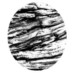
This is a textured brush created from a photo of the bark of an ancient tree in the back gardens of the Forbidden Palace in Beijing. The origin of the tree is a nice little trivia, but what I found interesting was the rough texture.


Photoshop's feature for creating custom brushes is a very powerful tool, but I still don't know how to fully utilise it. I created this wood grain brush as something to play around with and ended up using it in a somewhat unconventional way.
This picture was created exclusively using the wood grain brush and a simple palette of black and white.


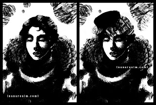
Usually I use brushes which have the 'Other Dynamics' box ticked in the brush settings, which allows some opacity variation for blending. However, I noticed that it damped the texture effect of the brush so I decided to leave it unticked. As a result every dab of the brush gives full opacity, i.e. black or white.
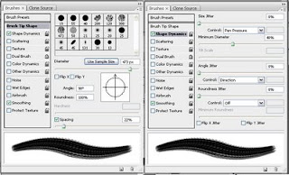
These were the settings I used for the brush. The only thing I varied as I got going was the Master Diameter, and occasionally the Spacing.


The main features of this brush is no opacity jitter and wide spacing, which makes sure that the texture comes through. It's also slightly oval, which gives some direction in the stroke. For example, the lace of her collar was done in a single stroke. Makes it seem simple doesn't it?
The time-consuming part was the face, since you can't be too rough while still making it look like a face.
Instead of using the brush in a conventional manner, I used it more like a sponge, creating shades by dabbing blacks and whites. By varying the brush size, the density of the 'holes' in the dab would change and I could thus lay down different tones. Then I would chip away with dabs of the opposite colour to refine the shape.


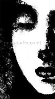
It may seem like a somewhat convoluted method, and sometimes it was quite difficult to get the right, but the end result was interesting enough to make it worthwhile.

Thursday 2 October 2008

Visualising in 3D vs. memorising lines - Part 2

A member on the Sweatdrop forums was asking how to draw the head from a low-angle view. I drew two examples of how I tend to approach this particular pose.


The example to the left keeps the normal, frontal-shot face shape. The only thing that happens is that the facial features are shifted upwards so that the chin becomes larger, and the underside of the nose becomes more prominent. The second example illustrates the tilting of the jaw and tends to look more extreme than the previous method.
The first example is an approach which I was able to do from very early on, but it took a few years before I could use the second method.
I learnt the first method by copying other people's work without really understanding the underlying principles. The tilted jaw line was more difficult to reproduce by copying however, so I was only able to use it to good effect once I could visualise the 3D form of the head.

It would seem that the 3D approach is far superior than the line approach, but if we look more closely, the two may not be totally unrelated.
Someone able to draw a face/pose without guidelines might have learnt how to draw using the line memorising approach, but, it could also be that they're so used to drawing that face/pose that they've moved past the need to construct in 3D. They know what the form looks like from any angle because they have already worked out the 3D problem multiple times, so they can now jump straight to the solution - the lines.

So, what's the difference between memorising other people's line patterns versus working things out yourself and then, when you're comfortable enough, use the line patterns you've learnt?
I believe the main difference is called your personal style.

Visualising in 3D vs. memorising lines - Part 1
Related post: The art of copying

Wednesday 1 October 2008

Visualising in 3D vs. memorising lines - Part 1

A while back I went to a manga-drawing workshop by the wonderful Emma Vieceli and Laura Watton. One of the many interesting things that were mentioned was related to how many of us approach drawing a figure.
We will take another look on the often somewhat controversial topic of copying which I've talked about in a previous post, and compare it to the "proper" way of learning to draw - visualising 3D form on paper.

When learning to draw people, folds, hair etc. by copying the line drawing of an existing artwork, certain line patterns are memorised. However, little knowledge is gained about the underlying 3D form which creates those characteristic lines. That means that you will most likely only be able to draw a pose from the particular angle that you copied it from.
I can't remember exactly what Emma and Laura called this kind of way to think about drawing, but let's call it the line approach for simplicity.

The other, usually more useful approach is the ability to visualise the form in 3D and translate that into a 2D line drawing. This takes a bit more time to learn since it's about learning to think rather than simply memorising lines, but it is an important, if not essential skill to learn.
By being able to visualise in 3D, it's possible to solve more complex poses and makes you more flexible as an artist.
The 3D approach is what is encouraged when how-to-draw books tell you to use spheres, cyliners and blocks to build up your figure. While it may be easy to draw geometrical shapes on paper, understanding the angle and depth relationships between blocks and being able to translate that into a human form takes some time.

Related post: The art of copying

Tuesday 30 September 2008

Rainy Nights

Back when I was taking my driver's license we were taught that a deceptively dangerous weather situation for driving is rain combined with darkness.
Normally the eye can largely adapt to the darkness of the road, but when the streets are wet the existing light sources are multiplied as well as spread out through their reflections. As a result, a wet night scene will take on a lot more brightness and colour than a dry night.
It's actually quite surprising how bright the night can become through reflections under the presence of only a few light sources. That being said, the reflected light tends to have a blinding effect on the eye, which makes it difficult to spot detail in the dark. Hence, one of the reason extra caution is advised to drivers on rainy nights. The other being the risk of slippery roads, especially at high velocities.


Image source: GettyImages